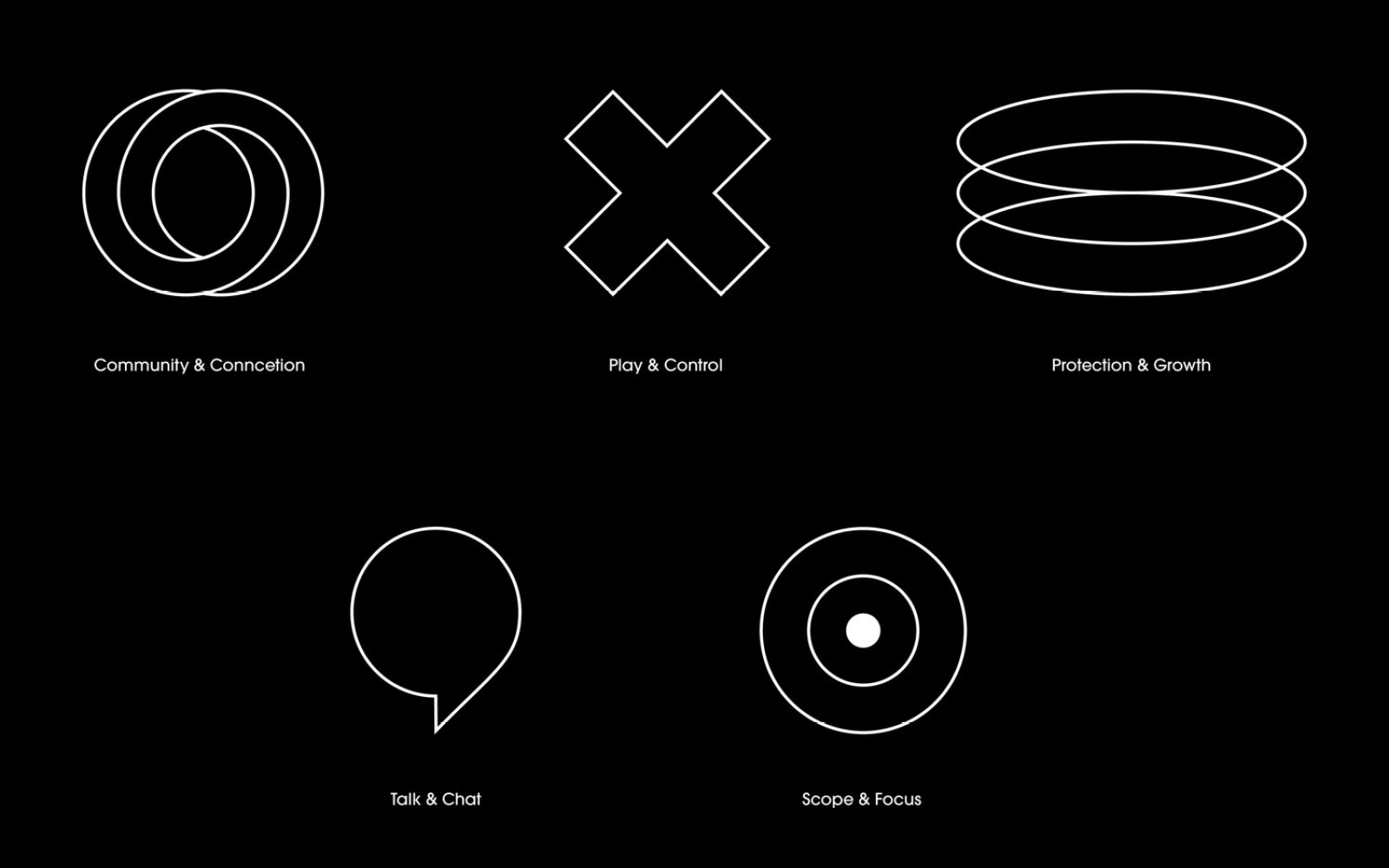
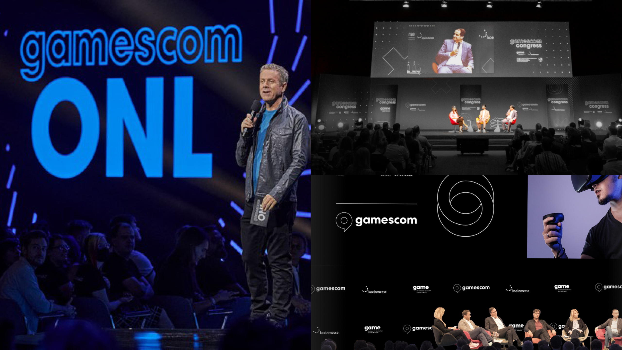
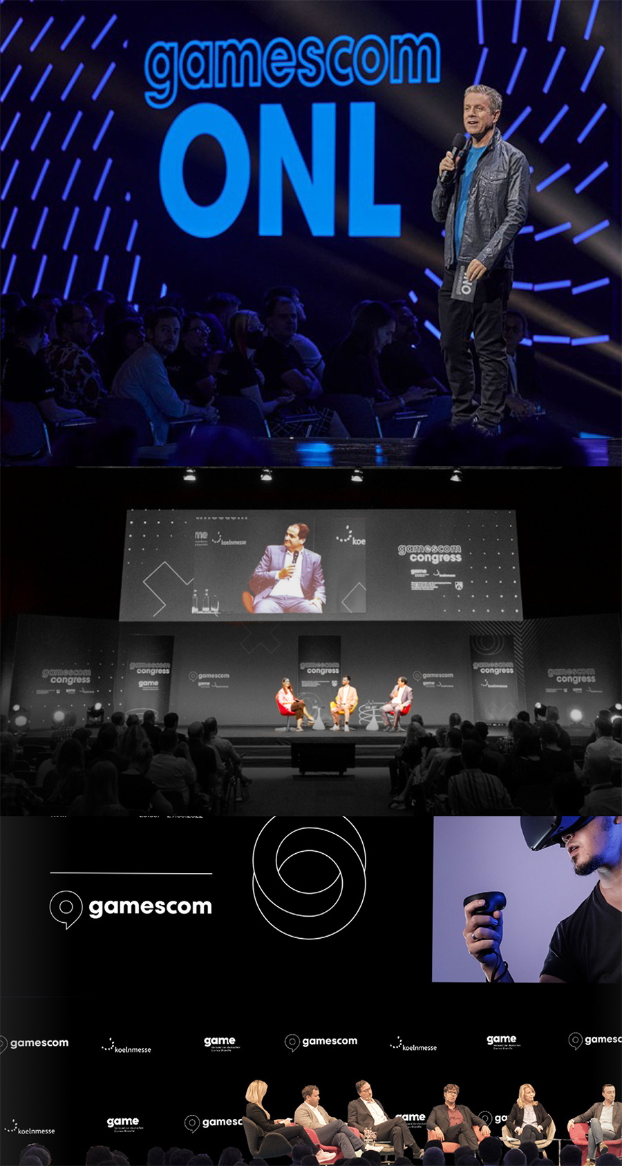
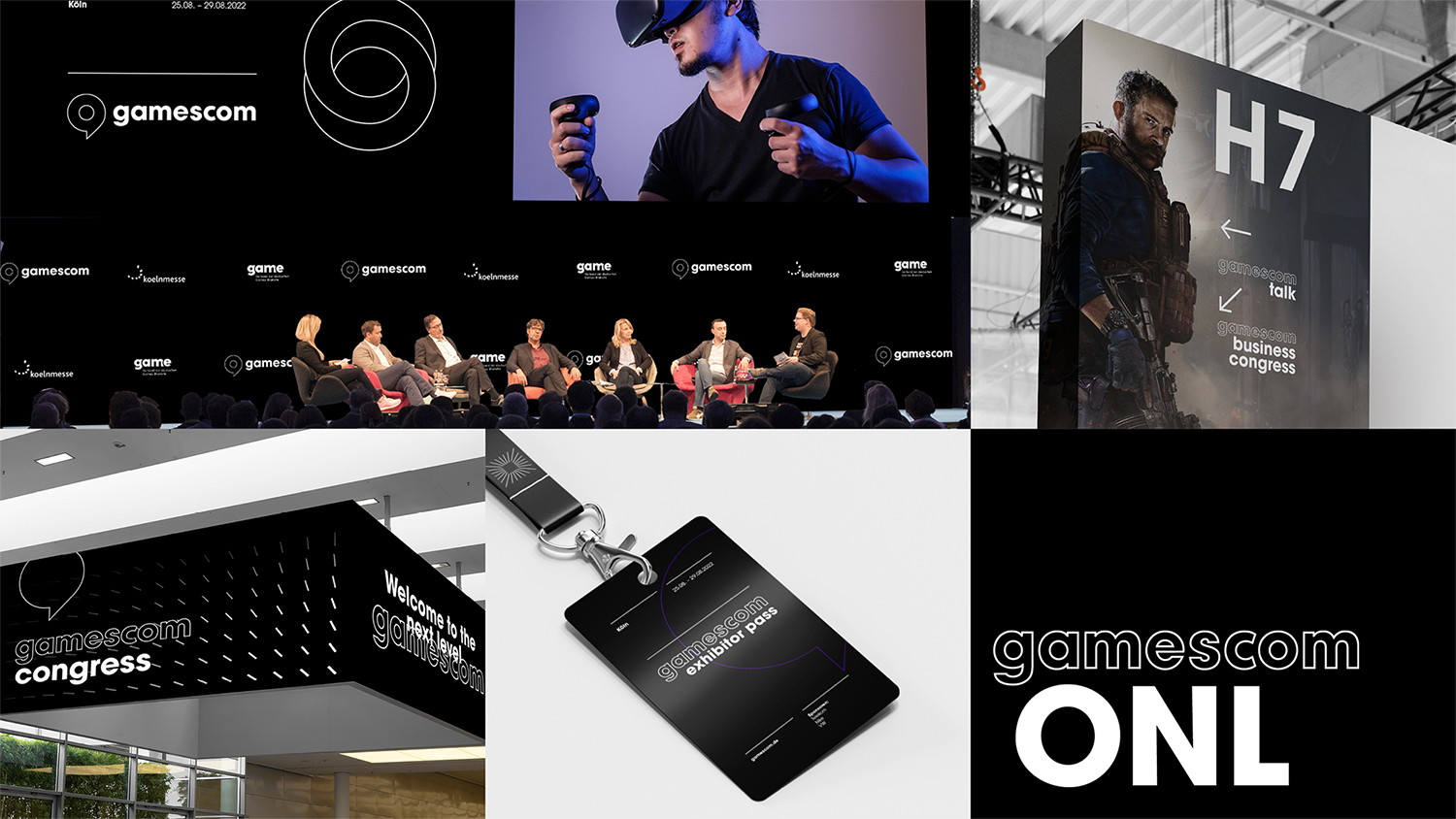
For the live return after the Corona break, we have repositioned gamescom - the world's largest gaming and fandom pop culture event - and reworked the brand identity. In the rapidly growing games industry, culture, technology and entertainment come together in a unique way without appearing "mainstream". And anyone who leads this global, pop-cultural movement like gamescom must also radiate this.
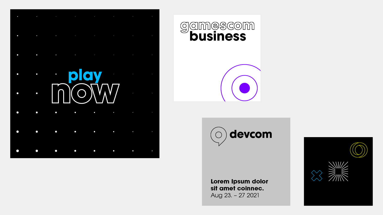
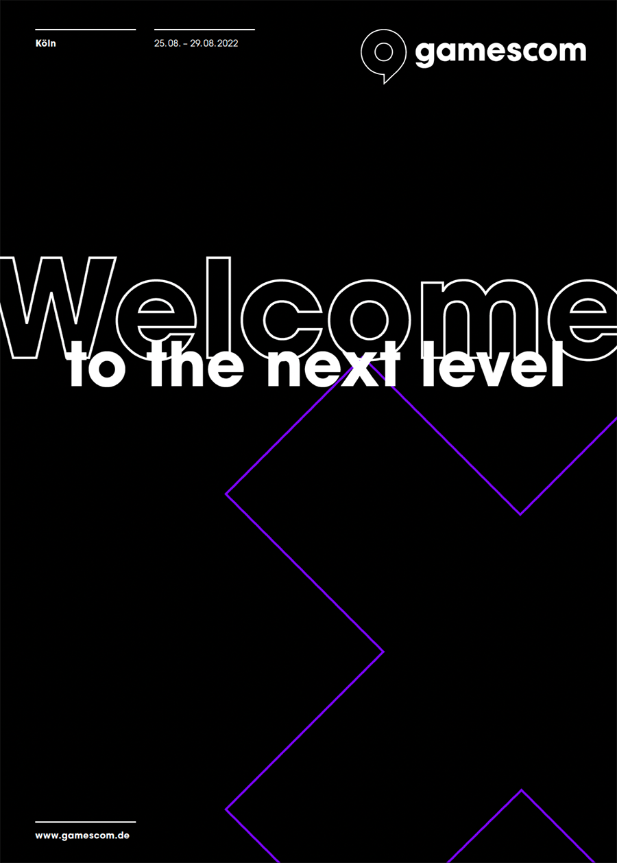
Therefore, more self-confidence, but above all more space for the curation of diverse content and the connection to the community are the cornerstones of the concept. The new brand identity is based on three simple pillars. The logo and lettering are based on the previous appearance, but two key details have been changed. The figurative mark moves in front of the word mark, is rotated and thus becomes an abstracted "g" for gamescom. The main difference, however, is that there is no longer an eye-catching colour code, but a concentration on black and white as the basic colours. This makes the brand an ideal "backdrop" for the colourful and diverse content relating to gaming and fandom.
A few additional elements of accent colours and icons make the appearance simple, clear and easy for all parties to activate consistently. The play with fonts in size, filling and overlay provides variance.
Services: Brand Strategy / Brand Positioning / Corporate Design / Logo-Redesign / Manuals






"DIE GAMESCOM IST DAS COACHELLA DER GAMER, DIE ART BASEL DES FANDOMS UND DAS EPIZENTRUM EINER NEUEN POPKULTUR."
Toan Nguyen, Jung von Matt/Nerd




Jung von Matt BRAND IDENTITY GmbH
Glashüttenstraße 38
20357 Hamburg
Fon +49 040 4321 2127
hello@jvm.bi
Jung von Matt BRAND IDENTITY ©2024


