From company to brand – or in other words: How to develop the design of a “traditional construction company” from Bielefeld into a “leading European technology brand for all aspects of construction”? By making the very special visible through design. The recipe for success of the family business driven company GOLDBECK is: “element-based construction with a system” – it makes building faster, more flexible, more efficient and more sustainable. Our idea of “serial design” translates the principle precisely and consistently to the entire visual brand identity.
Projects: Brand Design / Online Guidelines / Publications / UI Design / Employer Branding // JvM Creators: Positioning, HR-Campaign, Literature
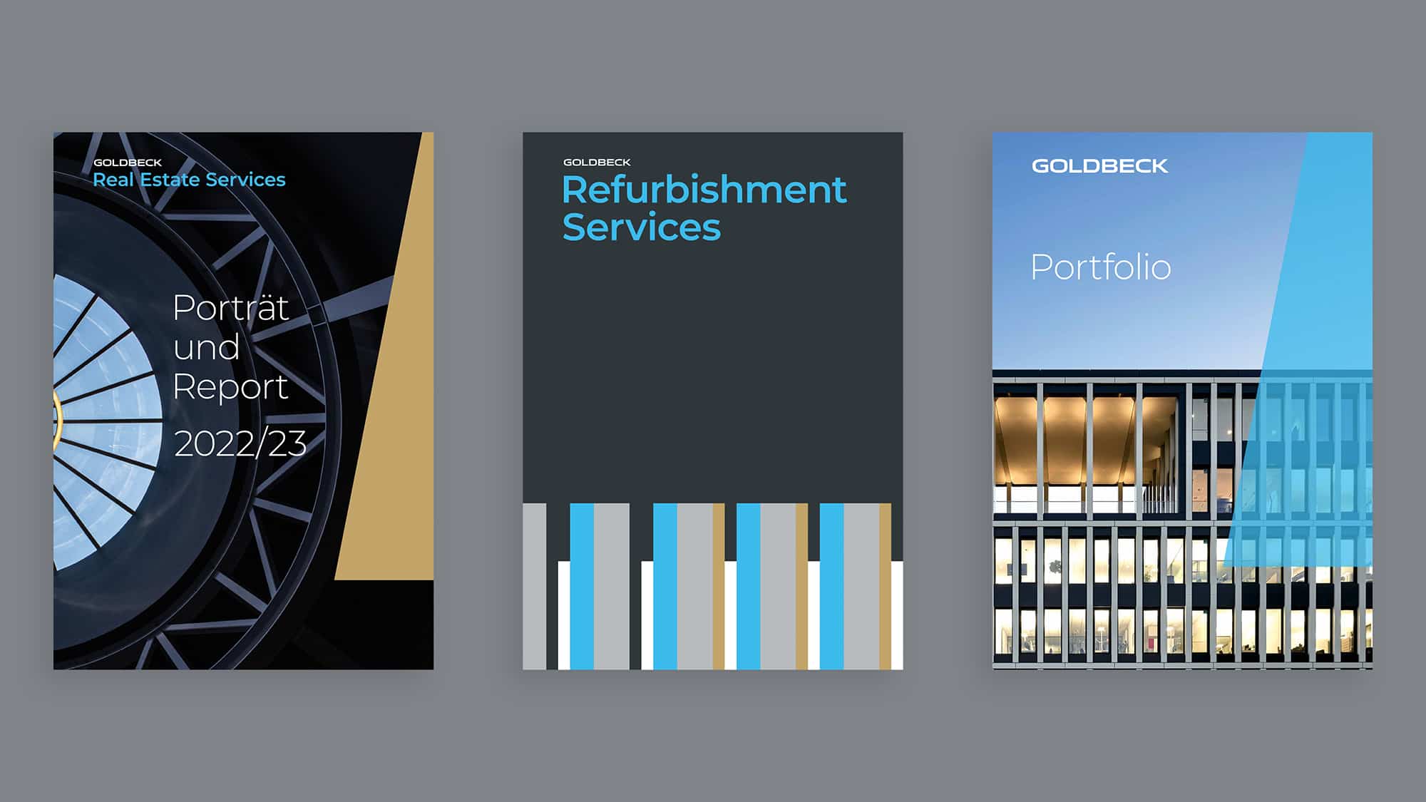
Evolution instead of revolution: focus on the word mark for more clarity, optimised in detail. Blue stands for GOLDBECK themes such as innovation, technology and sustainability. Complemented by carbon, white, gold and aluminium.

The picture mark remains a strong symbol of identification with the brand and also serves as a seal of quality.
GOLDBECK Next as a brand typeface. Clear lines with geometric elegance and the slightly technical character combine legibility with lightness.
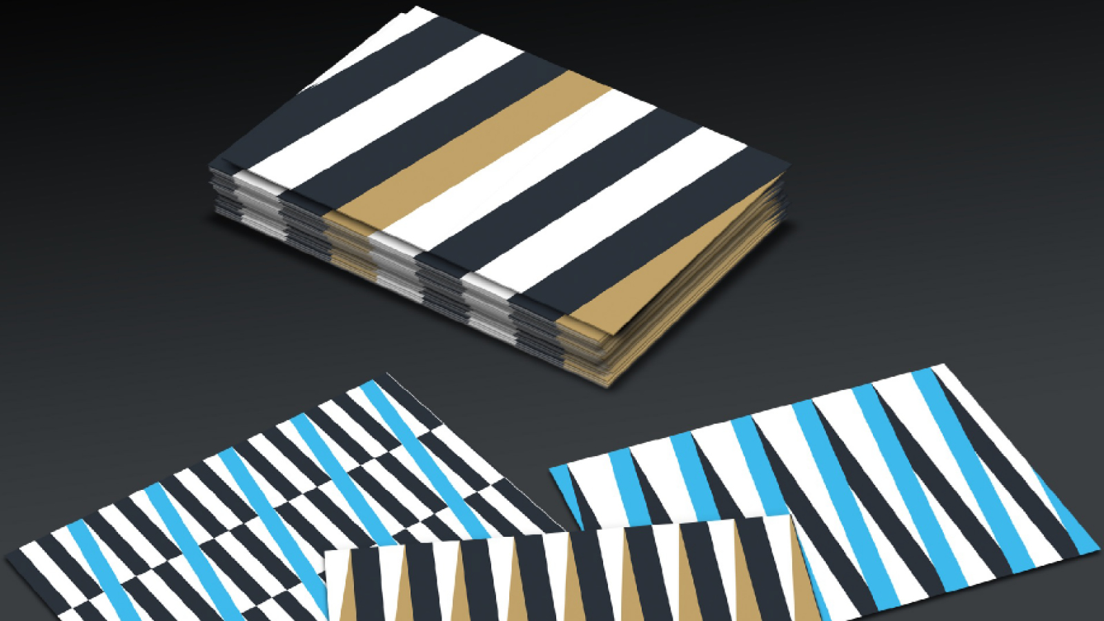
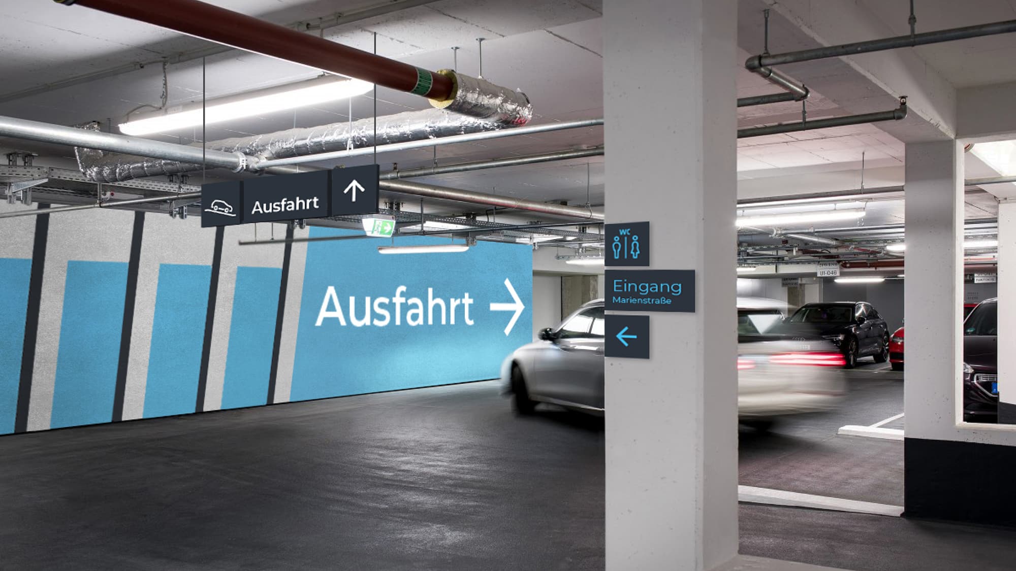
The speciality of GOLDBECK - the serial design - is graphically conveyed via the “serial patterns”.


Jung von Matt BRAND IDENTITY GmbH
Glashüttenstraße 38
20357 Hamburg
Fon +49 040 4321 2127
hello@jvm.bi
Jung von Matt BRAND IDENTITY ©2024