Reinventing the Meyer Burger brand - relying on our own name Meyer Burger, which enjoys a good reputation in the solar industry as a mechanical engineering company, but is completely unknown as a solar module manufacturer, especially among installers and end customers.
To realign the brand via the credible narrative of product innovation, sustainability and premium standards and to recharge it communicatively. Meyer Burger, a Swiss company rich in tradition, is known in the solar industry as a renowned manufacturer of machines for the production of solar cells. "Every solar panel in the world has Meyer Burger in it". - is how the company sees itself.
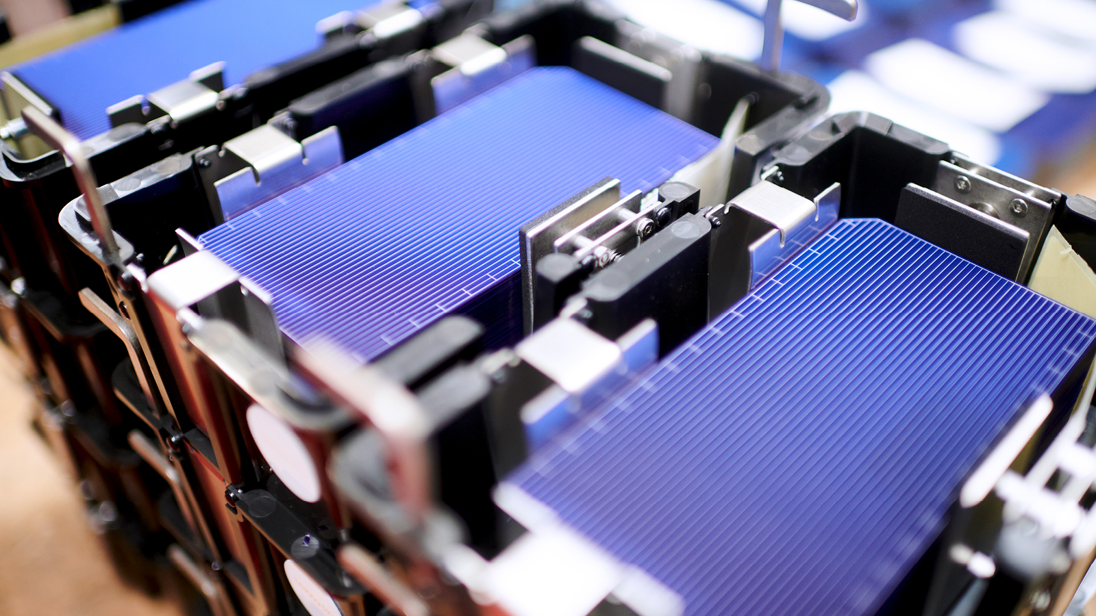
The problem: the machines and technological innovations were increasingly threatened to be copied in Asia, and the basis of the company's business began to falter. The strategic 180-degree turnaround: "Shut up and do it yourself". Or, to put it another way: Become a manufacturer of premium solar panels yourself, relying on decades of know-how and the technological edge of product innovation developed in-house - developed in Switzerland and manufactured in the former "Solar Valley" in Germany.
Projects: Brand Strategy / Brand Positioning / Corporate Design / Icon Design / Prospects / Identification & Signage / UX Design


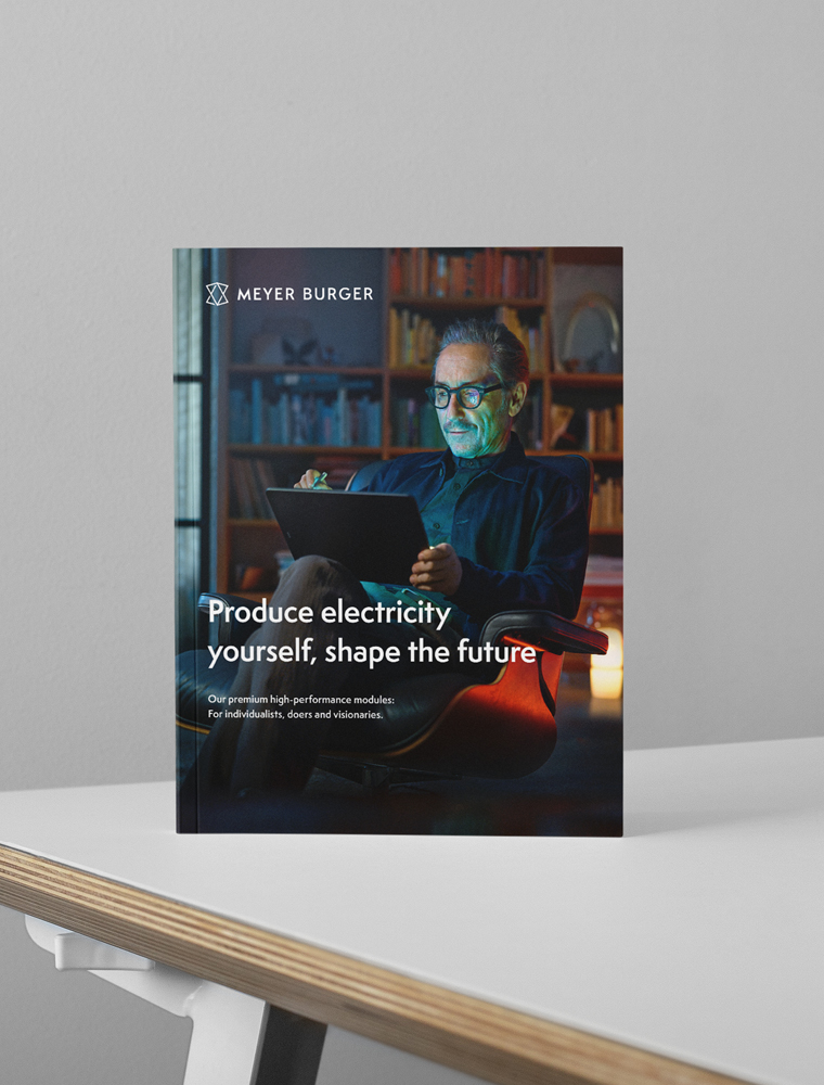
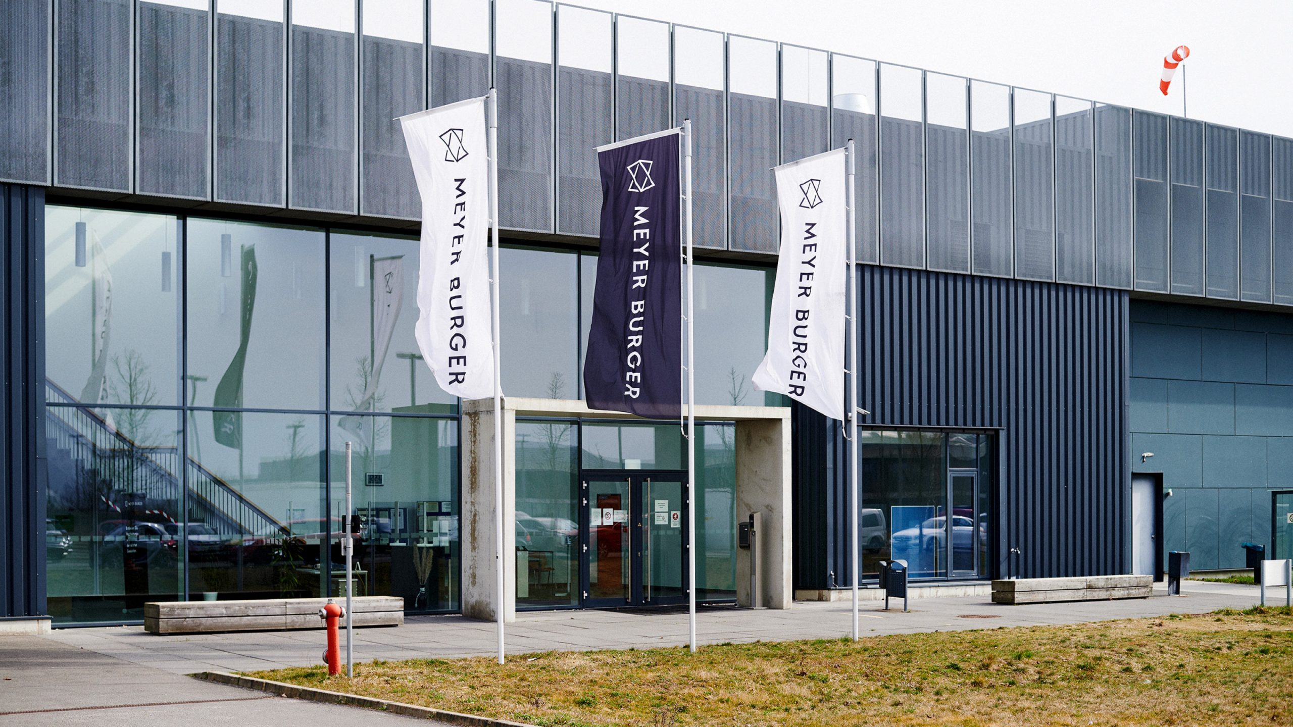
A logo that identifies Meyer Burger as a manufacturer of innovative solar modules. A colour concept that underlines the brand's premium claim and refers to its Swiss origin. A typeface that conveys our messages with confidence and character. And last but not least, UI elements that make the brand unmistakably tangible in digital applications.
A brand identity that visually implements the strategic claim - "Shaping Premium Solar Technology that pays off for everyone." - visually. A clear signal of a new start in the market with the ambition to leave well-trodden paths. A symbol for cultural change and an inward identification offer. The special challenge: "From Backstage to Spotlight" - i.e. from kick-off to product launch - in only five months.


Jung von Matt BRAND IDENTITY GmbH
Glashüttenstraße 38
20357 Hamburg
Fon +49 040 4321 2127
hello@jvm.bi
Jung von Matt BRAND IDENTITY ©2024